C-squared

BRANDING

Client։

C-squared (C2)

CREATION:

Brand ideology & essence development, Naming, Logotype

CREATORS:

Project manager: Alexander Plato
Naming: Raul Mkryan, Armen Kosyan
Brand essence and ideology: Raul Mkryan, Lusine Mnatsakanyan, Armen Kosyan, Gohar Baghdasaryan
Logotype and visual identity: Gohar Baghdasaryan

C Squared

About C2

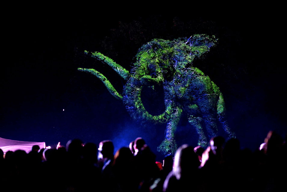
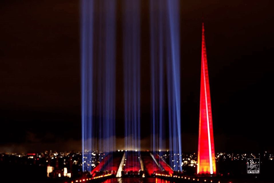
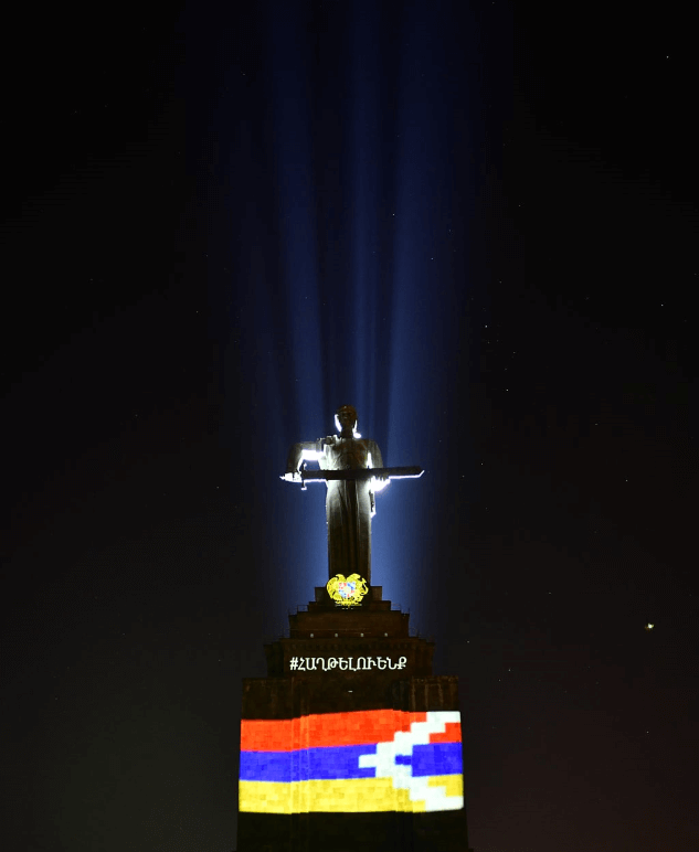
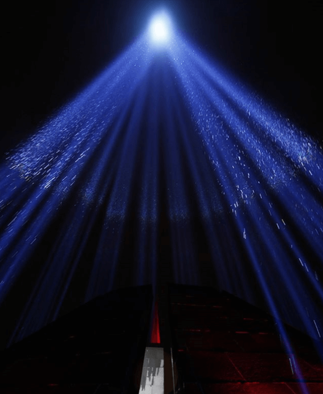
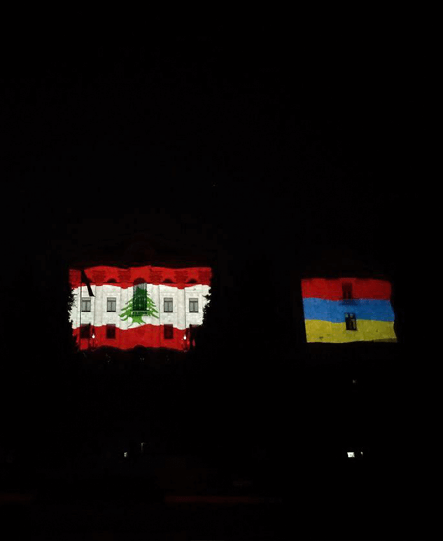
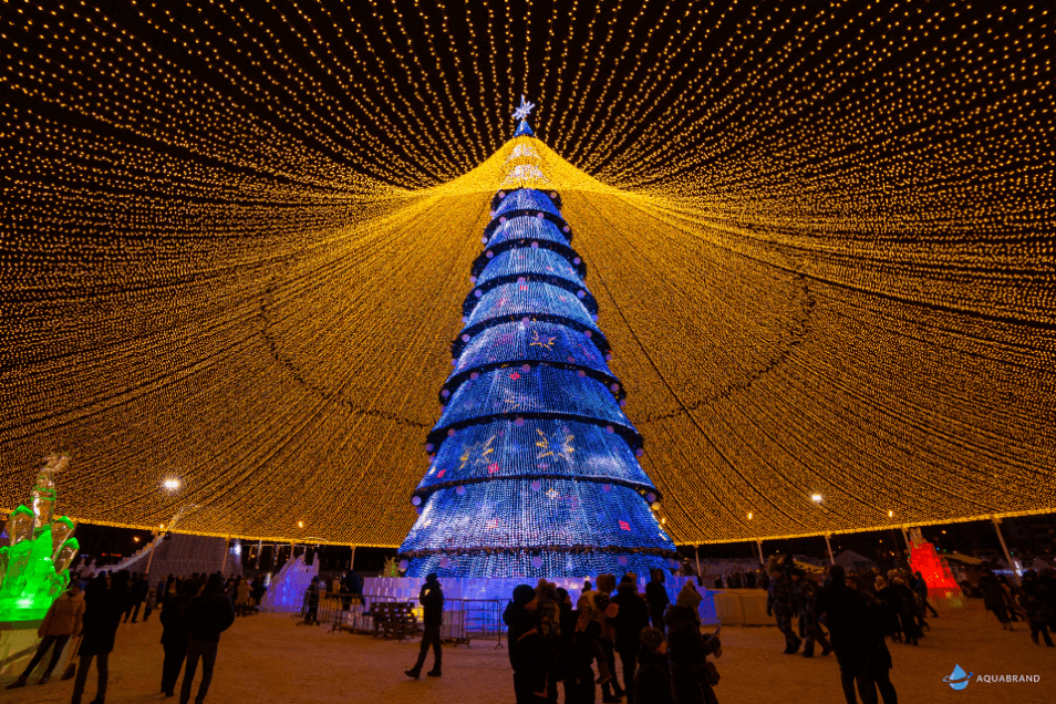
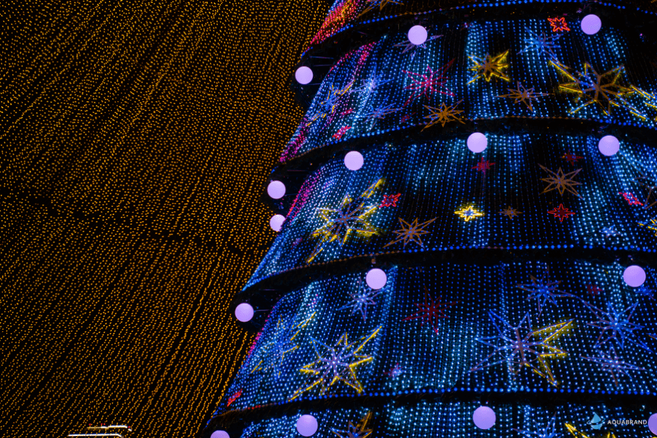
C2 is an international media company with a team of professionals specialized in media and innovative projection technologies. Having profound knowledge in media content production and combining it with a wide range of technical creative solutions, they transform the physical space and bring the audience to the magical world of immersive environment. One of the peculiarities of the team is that besides showing vast know-how in the tools of the field such as AR/VR systems, holograms, 3D mapping, light, and laser shows, they also apply combinations of these in projects for magnifying the “WOW” effect on the audience.

Vision

C2’s vision is to see a world where all the people are able to get their imaginations into the real world – fulfilling real-life with unreal colors and positivity.
C2 Vision
C2 Mission

Mission

Imagination should be shared with the environment – as beautiful as it is in our minds. C2’s mission is to protect the customers’ bright imaginations to reality and share it with their valued ones. Our belief is that humanity should never settle, never back down from its ambitions, in spite of the technological obstacles. Good is never enough.

IN THE BEGINNING, DARKNESS WAS OVER
THE SURFACE OF THE DEEP

We are taking the limitlessness and adding some
perfection to the mix.

WHEN THE WORLD SEEMS GREY, PAINT IT AS A CHILD

We went back to the years fullest of imagination, fun and exploration–our childhood, when we interpreted the world full of colors.

One object stood out from our childhood–the kaleidoscope. The kaleidoscopic visuals are the cornerstone of C2’s visual identity. These visuals show the possible lustrousness we should be trying to achieve in the dullness surrounding us.

Aa

Lato/Bold

ABCDEFGHIJKLMNOPQRSTUVWXYZ

abcdefghijklmnopqrstuvwxyz

0123456789

[&.,:;¿!€$™]

Aa

Lato/Bold

ABCDEFGHIJKLMNOPQRSTUVWXYZ

abcdefghijklmnopqrstuvwxyz

0123456789

[&.,:;¿!€$™]

Aa

Lato/Bold

ABCDEFGHIJKLMNOPQRSTUVWXYZ

abcdefghijklmnopqrstuvwxyz

0123456789

[&.,:;¿!€$™]

C2 1
C2 2
C2 3
C2 4
C2 5
C2 6
C2 7
C2 8
C2 9
C2 10
C2 11
C2 12
C2 13
C2 14

Discover other projects...

C Squared

When we got tasked with creating a brand for a company that does visualizations and light shows, we knew that the company had to be an outburst of imagination. 

Essence
We full-heartedly believe that the imagination has no limits, it never stops escalating, digging, searching for and creating something new or a new synthesis of many olds․
Therefore, when it comes to creative work there should be no clear boundary between the real and the ideal. Based on this idea we began brand attribute creation. 


Naming
Like imagination, we built our naming process on the idea of limitlessness. The C in the name represents the speed of light in physics (299,792,458 m/s), which is the accepted speed limit in the universe. But, being the creative visionaries that they are, we thought, they are not bound by the rules. Thus, C2 takes the speed of light squared as its ideology of creation.

Logotype
The “C” in the logo is composed of two concentric circles, the diameters of which are drawn in the golden ratio to portray the idealism embedded in the company.
The cutout of the “C” is made with two perpendicular lines which are components of the company’s identity.

Colors
When creating the logo, we wanted to show the beautiful relationship of light and dark, of positive and negative, of yin and yang. The logo does not contain any effects, shadows or shades. Two colors are used, full white (FFF) and full black (000) – two clean slates which allow the creators to be as free in their imagination as they can.
Black conveys professionalism and credibility, while white represents clarity and pureness. 
The symbiosis of the two makes a logo that stands for the creativity and professionalism that the people behind the logo have and are willing to use for creating different realities for their clients.

Implementation
When creating the visual identity of the brand we went back to the years fullest of imagination, fun and exploration–our childhood, when we interpreted the world full of billions of colors.
One object stood out from our childhood–the kaleidoscope–which has many similarities with the company’s product and many more positive associations from our childhood. The kaleidoscopic visuals are the cornerstone of C2’s visual identity. These visuals show the possible lustrousness we should be trying to achieve in the dullness surrounding us.

Scroll to feel the brand on its full