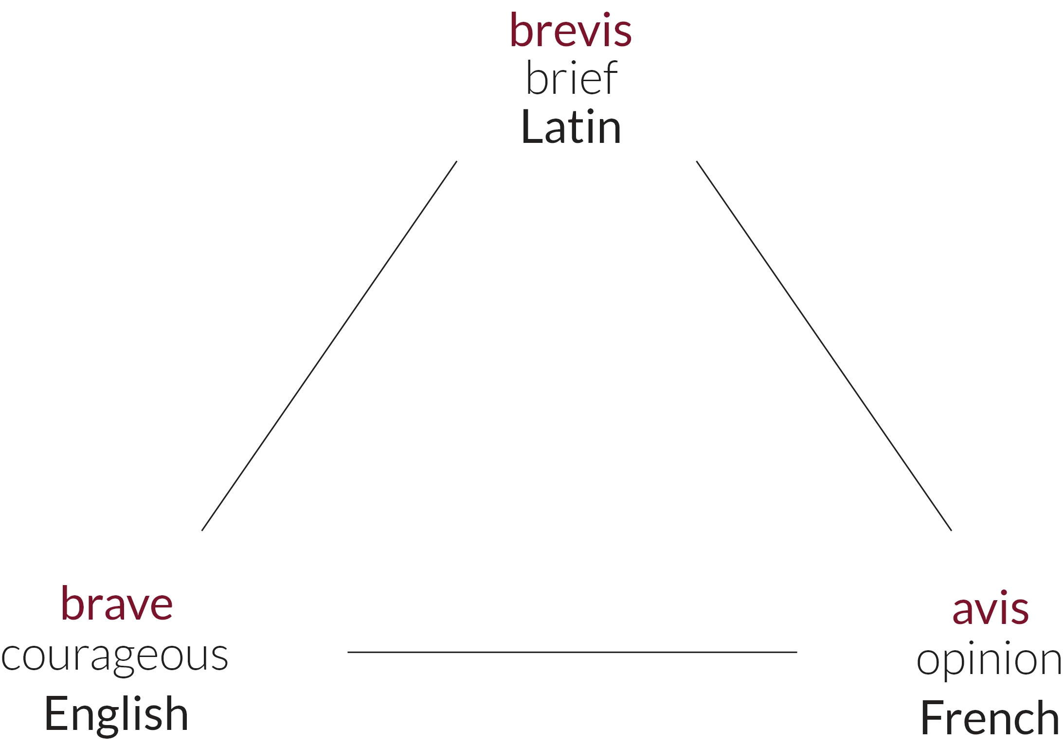
Breavis Logo

The Name

Breavis is a word originally created by the company’s branding team.
It consists of three words from 3 languages.

Breavis - Naming

Therefore Breavis means brave opinion!

The Logo

Breavis logo consists of a wordmark and a symbol. The wordmark and the symbol must always be used together on all the communications of Breavis. The symbol of the brand is the bow and the arrow, which stand for accurate planning and precise targeting. The idea comes from a legend about the Bowman, who would shoot the target with eyes closed. When people asked about the secret of his success, he would respond: ”It is not about shooting, but planning and excellence. If you plan your work and platform all the steps excellently, you can shoot the target even with closed eyes”.

Breavis Wordmark

Wordmark

Breavis Symbol

Symbol

Logo Use

Breavis logo consists of a wordmark and a symbol.
The symbol and the wordmark must always be used together on all the communications of Breavis.

Logo Colors

Breavis logo is expressed in one main color-dark red. The brand color symbolizes Strength, Power and Determination. The brand also has supporting colors. The brand color must be used consistently across all the international and external communications. Great care should be taken to ensure accurate color reproduction when the logo is applied to all types of paper and materials, as well as web and broadcast channels.

Dark Red

#7C122A

R124 G18 B42

C31% M100% Y76% K38%

Dark Gery

#221F1F

R34 G31 B31

C70% M67% Y65% K74%

White

#FFFFFF

R255 G255 B255

C0% M0% Y0% K0%

Typography

FONT FOR LOGO I TRENCH THIN

Aa

ABCDEFGHIJKLMNOPQRSTUVWXYZ

abcdefghijklmnopqrstuvwxyz

0123456789

[&. , : ;¿!€$™]

FONT FOR TEXT UNDER LOGO I AILERON THIN

Aa

ABCDEFGHIJKLMNOPQRSTUVWXYZ

abcdefghijklmnopqrstuvwxyz

0123456789

[&. , : ;¿!€$™]

CORPORATE FONT I SEGOE UI

Aa

ABCDEFGHIJKLMNOPQRSTUVWXYZ

abcdefghijklmnopqrstuvwxyz

0123456789

[&. , : ;¿!€$™]